September 2025
In the spotlight: Ashlyn Lincoln
Discover how Ashlyn brings warmth, texture, and soul to her home with KAS.
Known for her warm, layered approach to interiors, photographer and stylist Ashlyn (@ashlynlincoln) blends colour, texture, and personality to create spaces that feel both inviting and effortlessly stylish. In our chat, she shares how she curates her home with intention, the KAS pieces she loves most, and her go-to tricks for mixing and matching with confidence.


How would you describe your personal home decor style?
Up there with the things I enjoy most in life are homemaking and hosting people I love, so I think I’m always subconsciously curating my home based on what feels both grounding and inspiring to me, and by extension what feels welcoming and delightful for others. Essentially I’m all about creating spaces that people (myself included) don’t want to leave. I’ve honestly never known how to describe my aesthetic, but before I overthink it the elevator pitch that comes to mind is “thoughtfully curated with a strong emphasis on warmth, texture, and soul”. I love spaces that feel lived in but intentional and not necessarily ‘on-trend’. A mix of natural materials (there will always be travertine), colourful accents grounded by neutrals, photography prints from my travels, and personal treasures collected over time and across the world. It’s part contemporary, part vintage, and part “I found this at a trash & treasure market and it is henceforth my entire personality.”
I’m all about creating spaces that people (myself included) don’t want to leave.
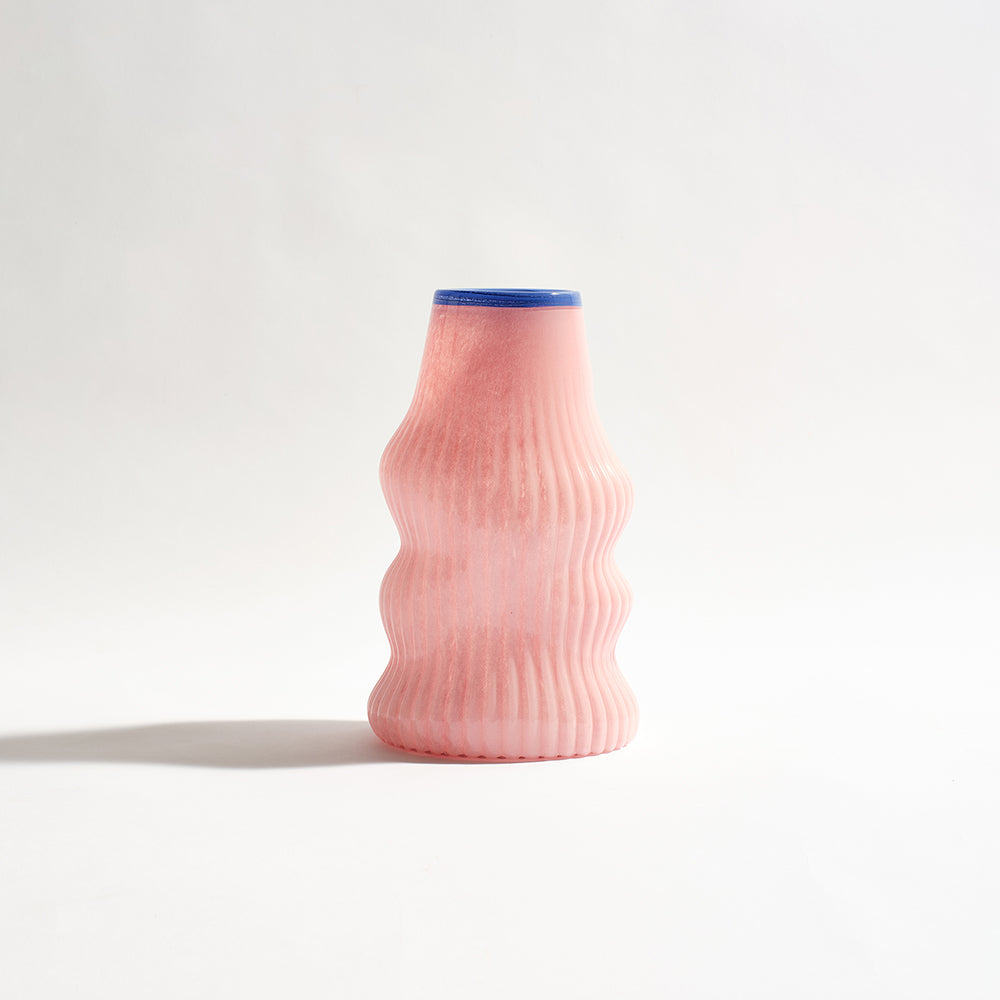
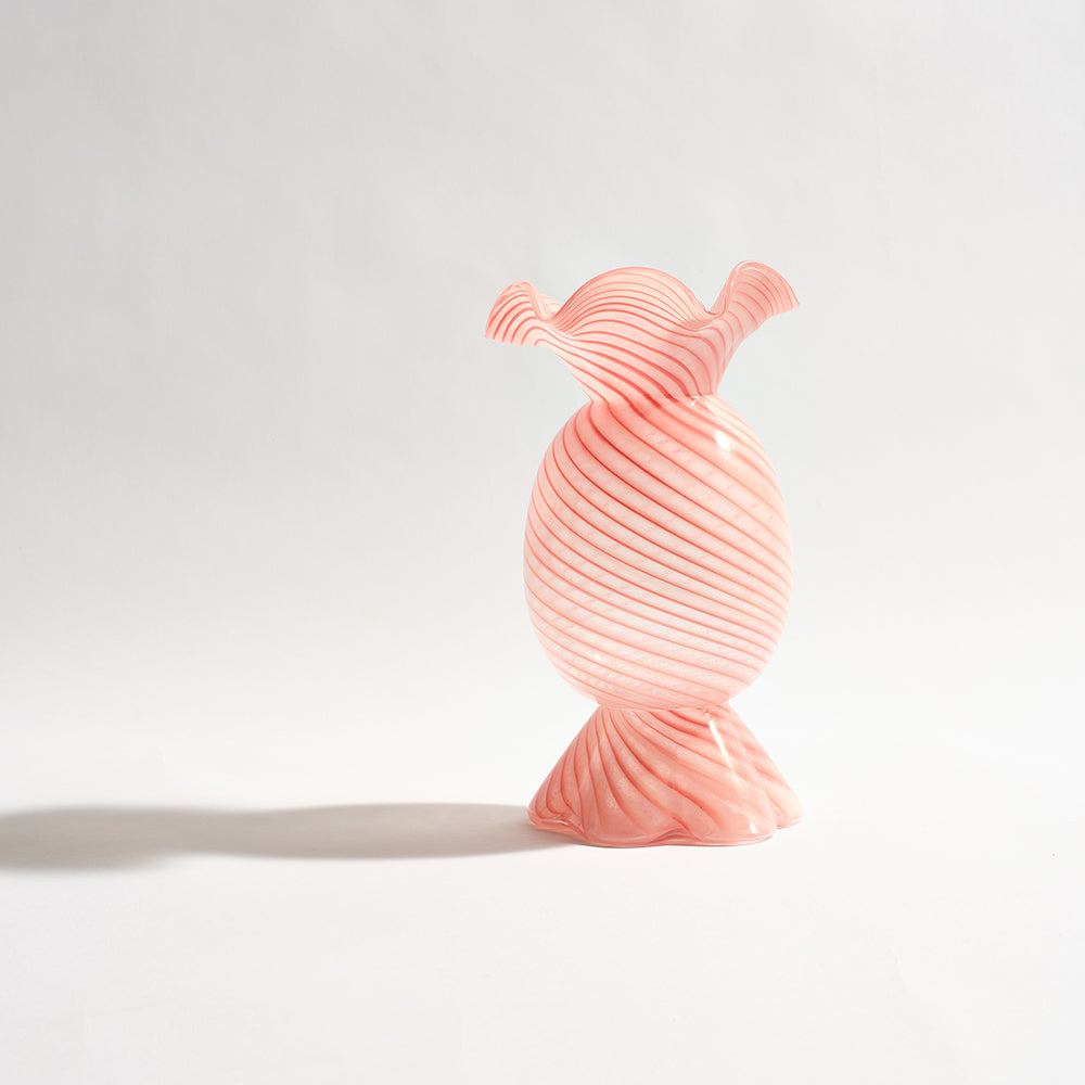
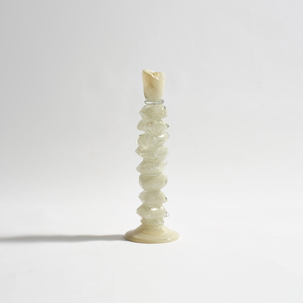
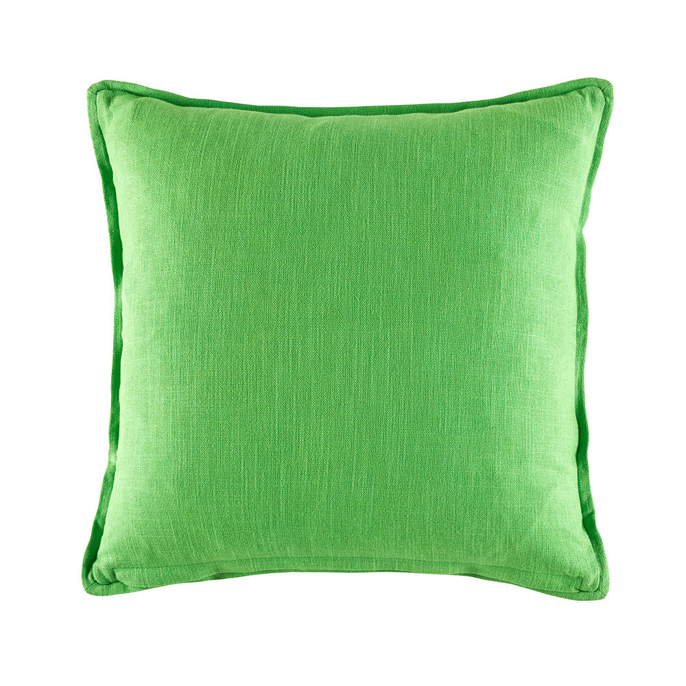
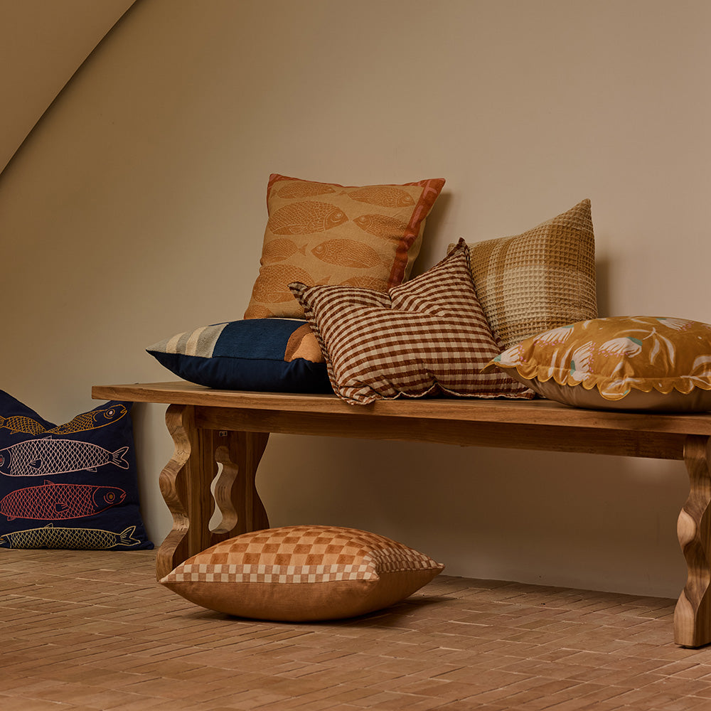
 SHOP THE LOOK
Which were your favourite KAS products to style and what drew you to them?
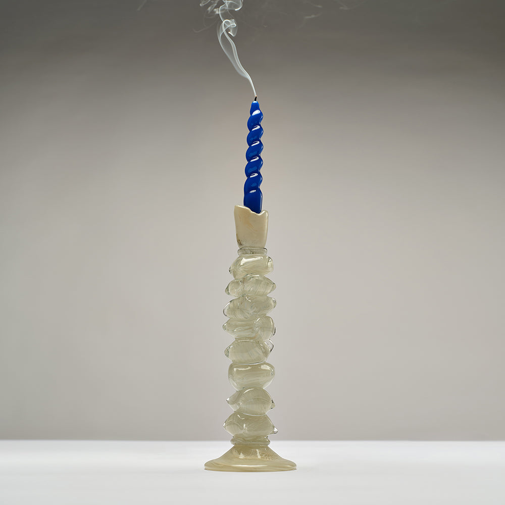
I have become a certified glutton for KAS glassware over the past few years. The unique shapes & gorgy colours make my brain very very happy — I think the kids of TikTok are calling it ‘dopamine decor’?For the most recent shoot, I went wild for the green Fleur vase which works anywhere and everywhere, as well as the crazy cool white ‘Tizi’ candle holder which is equally a statement piece as it is endlessly versatile. I LOVE how KAS glassware is adaptable enough to layer into almost any setting, but with enough personality to keep things from feeling flat.

(The Fleur Vase also comes in Red and Pink)
Can you walk us through your styling process when arranging KAS products in your home?
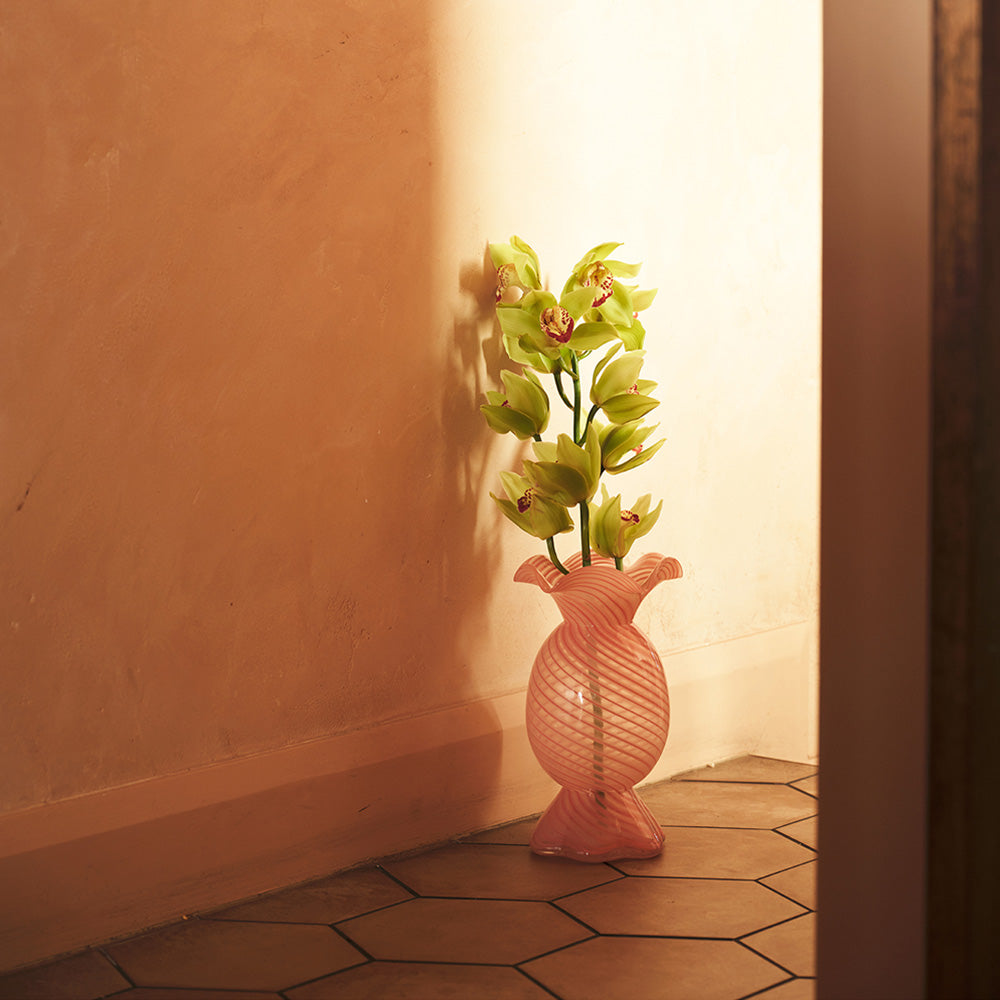
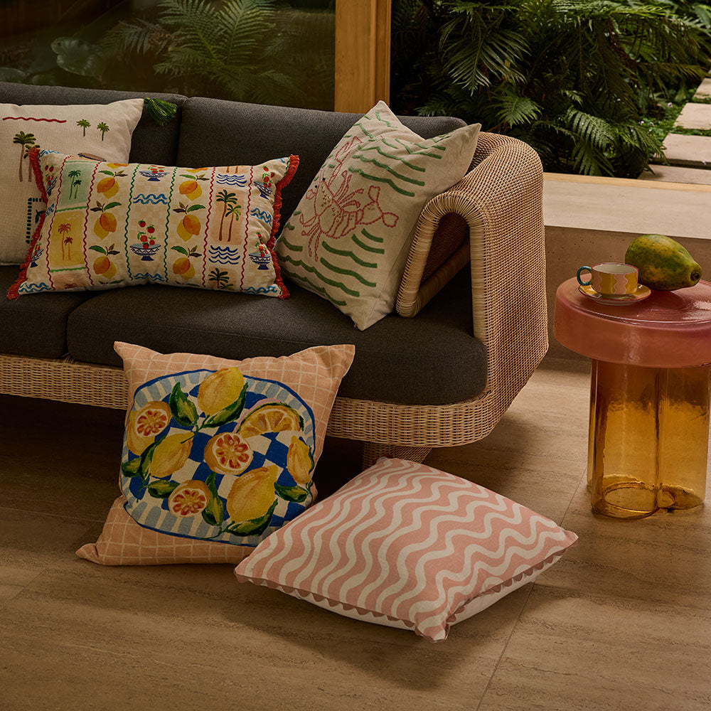
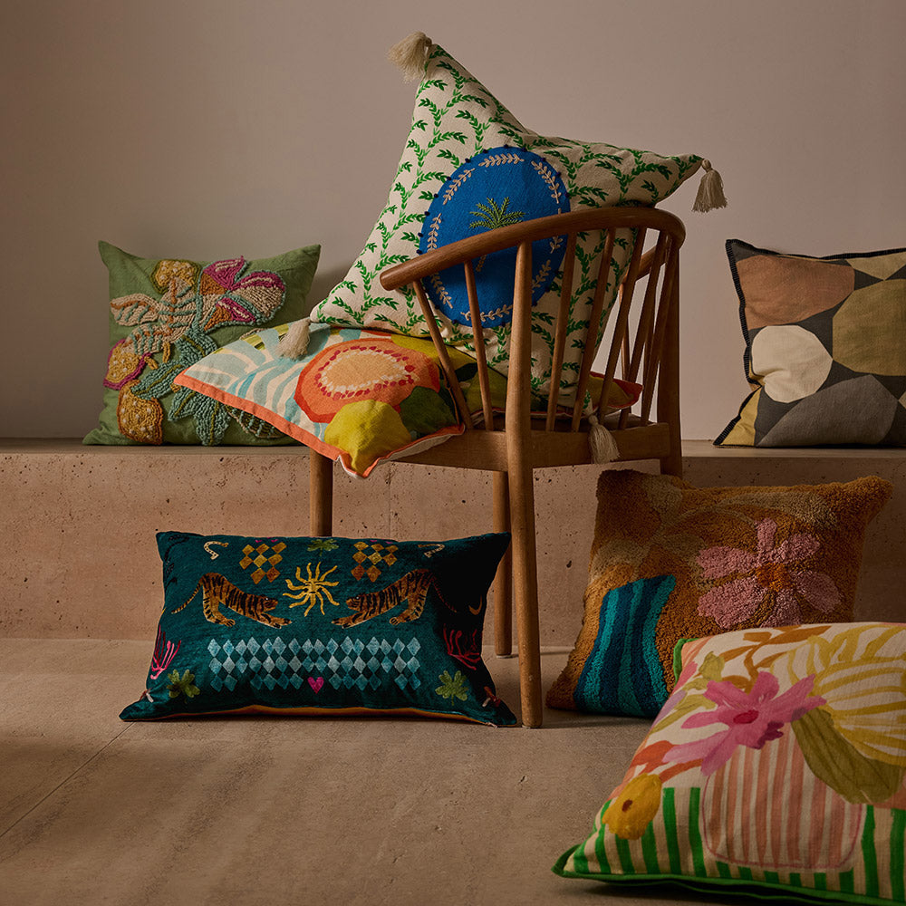
This is probably a very un-technical response but I’ll always start with the one hero piece/s I’m drawn to the absolute most (whether that’s an artwork, cushion, vase or chair) and build the rest out from there. Obviously the one caveat is that the piece must work with existing furniture and artwork unless you’re decorating a space from scratch! So using this living room example, whatever I chose had to work with the coral sofa and photography prints which were already very colour-heavy. I started with the gorgeous green Fleur vase, and then selected a few cushions with greens to carry the accent colour through the room —especially since there was no green in the artwork. I needed to bring a colour from the artwork that would complement the sofa and work harmoniously with the green, so I chose yellow — seen in the lemon cushion, books, and flowers. I then filled the rest out with items that were neutral but textured to add warmth but without competing with the heavily coloured or patterned pieces. When styling surfaces (like this coffee table), I like to play with different heights using book stacks, vases, candles and candle holders.


How do you mix and match different textures and colours in KAS products to create a cohesive look?
With colour, I’ll have a loose tonal palette in mind depending on the mood I’m going for. I’ll usually use different hues of the same family for depth, and then add one or two accents to draw the eye and stop it from feeling the dreaded matchy-matchy. The key with using accent colours is to ‘bring it through’ each main area of the room and isn’t concentrated in one section. I then lean heavily into texture: smooth against grainy, soft against structured, glass against bouclé — little contrasts that make the space feel more dimensional. I also rely on texture to add depth to the neutral pieces I use to ground a look (a natural bouclé cushion, for example) which is needed when you’re partial to a lot of colour! KAS makes this process ridiculously easy because so many of their pieces feel related but not identical, which means they sit together naturally without feeling too safe or as though you’re trying too hard to achieve cohesion.